Data Analysis and Visualisation For Biological Data
Data analysis and visualisation is more important than ever before.
We are now undoubtedly entering a golden age of innovation in sequencing technology. However, the advances in Next-Generation Sequencing (NGS) technologies and new sequencing machines bring benefits, as well as new challenges, to researchers. In fact, massive data streams are generated every day, and finding suitable data analysis and visualisation methods has become more vital.
Why Is Data Visualisation So Important In Biology?
In biology, the complexity of biological problems requires the understanding of networks and interactions of chemical components, as well as the analysis of gene regulation, metabolic pathways, variance, co-variance etc. In fact, networks can become so cluttered and chaotic that it becomes challenging to make sense of data. Consequently, making sense of the data is frequently reliant upon visualising networks.
Indeed, turning data into meaningful results has become so important that, lately, a large number of initiatives have been focusing on data visualisation. In fact, projects such as “Information is beautiful” and “Plankton Chronicles” represent information and science through art. Also, other initiatives have combined some of the techniques in microbiology research for the creation of art and sculptures.
Data Analysis And Visualisation For ‘Omics Data
Biological data are used for a wide range of applications such as drug discovery, development, oncology, and biomarker research. However, in these domains ‘omics data are extremely high-dimensional and consist of strings of letters too extensive to be interpreted meaningfully by the human eye. Hence why data visualisation is integral to ‘omics data analysis.
Representing ‘omics data in charts and maps is beneficial because:
- It helps to view a large amount of information at a time
- It allows for easy identification of patterns and trends from a massive volume of data
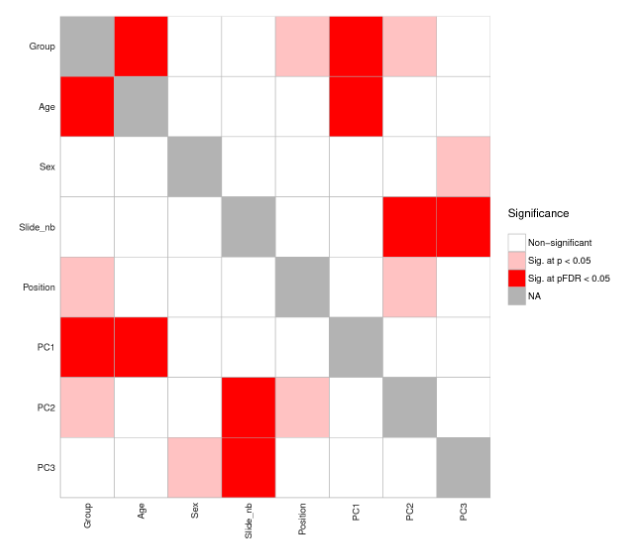
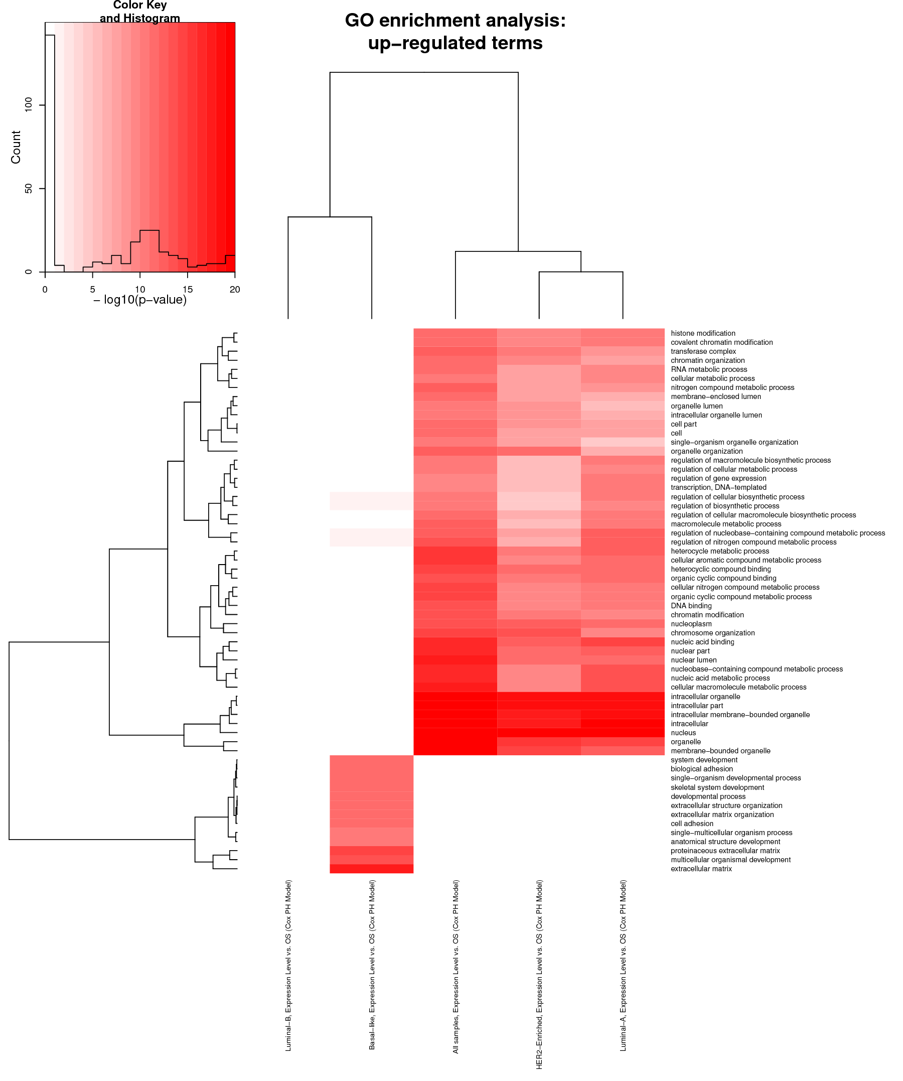
However, the dilemma is selecting what to include or exclude in the visual interface. In addition, determining which type of graph or diagram is suitable for representing that type of data can also be challenging. For this reason, several algorithms have been created to represent biological data from a high-dimensional to two-dimensional (2D) space. The most common interfaces are generally heat maps, volcano plots and bar charts.
Data Visualisation & Heat Maps
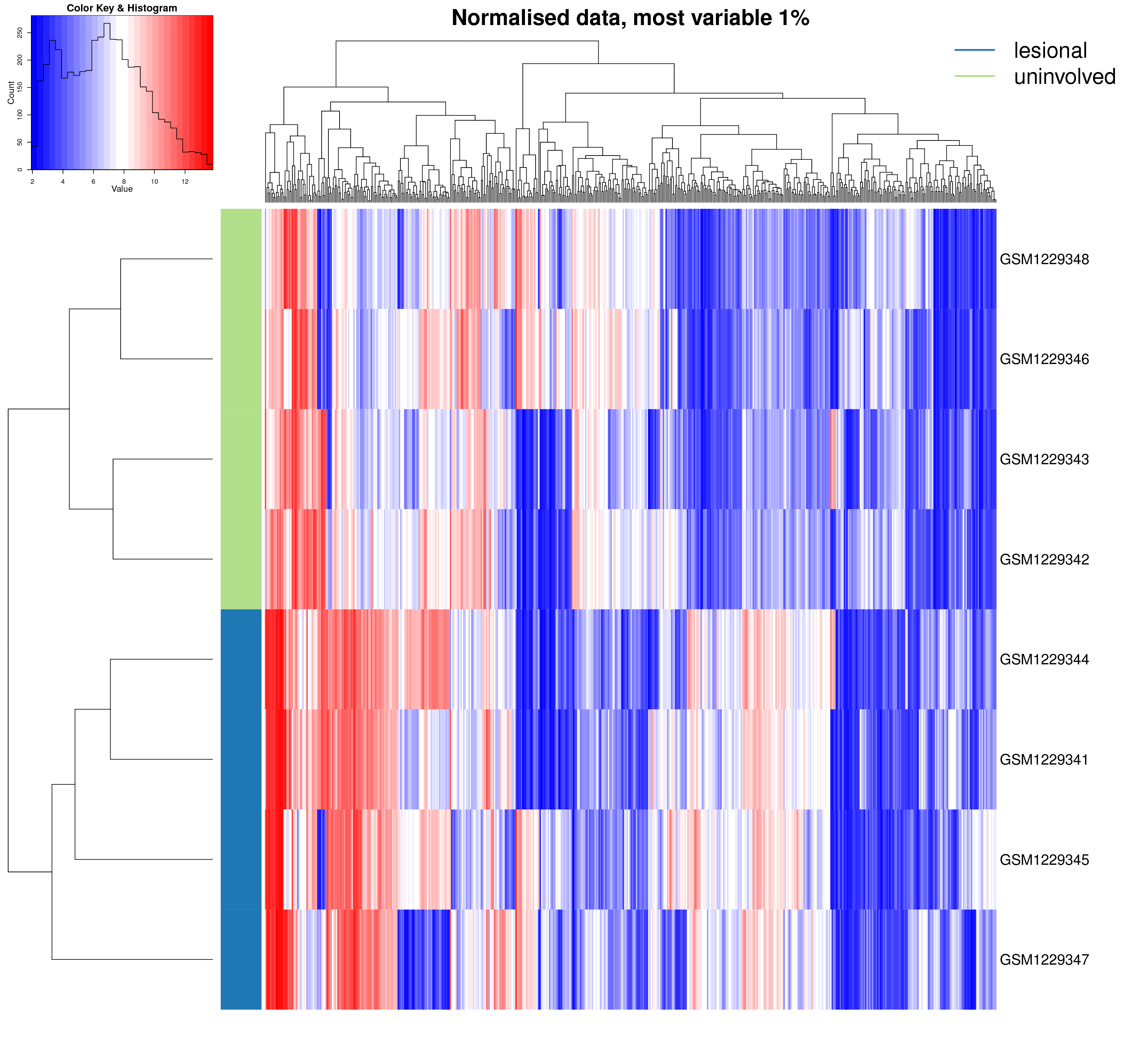
Heat maps are very handy chiefly for large, multi-dimensional datasets visualisation. A heat map is, in short, a 2D graphical false-colour image representation of data which makes use of a predefined colour scheme. Different colours display different values and also variations in a data matrix.
High-throughput gene expression data is often displayed using heat maps with data displayed in a grid where each row represents a gene while each column represents a sample. The colour as well as the intensity of each box represent variations of gene expression. Scientists often use green-black-red heat maps in particular to visualise gene expression data from microarrays.
Clustering
Heat maps represent clustering (i.e. statistics) in a way that our mind can actually catch. Basically, clustering methods allow you to group genes and/or samples together. Samples can be obtained through high-throughput sequencing methods such as RNAseq or DNA microarray studies.
Since clustering criteria usually includes similarity of gene expression pattern, this visualisation tool can be useful for identifying biological signatures of interest that can be associated with a disease and genes that are commonly regulated.

We can use heat maps for a variety of reasons, such as to compare gene expression levels across a number of different samples. These samples can be from different patients or also from cells under different conditions.
Colour variation differentiates genes that are upregulated (i.e. with a high relative expression value) from downregulated genes (i.e. low relative expression value). Thus, a simultaneous visual representation of gene expression levels across multiple different samples is provided.
For example, heat maps enable us to understand what groups of genes are turned on or turned off in various cancer samples and compare them to control samples. For instance, take gene expression profiling of breast cancer samples. In this case, data analysis and visualisation via the use of heatmaps allows us to gain insights on the differential patterns of gene expression across multiple individual tumours.
Interactive Heat Maps
Interactive heat maps allow an even better exploration of specific areas of interest than static heat maps.
They chiefly differ from static heat maps by allowing you to zoom-in. This is particularly useful if the goal is to focus on a specific value or region.
Moreover, interactive heat maps enable better identification of hidden groups among analysed genes, and also associations between a certain condition and a gene pattern. By simply hovering the mouse over the map, it is possible to detect the label as well as the name of a specific area of the heat map.
To illustrate, the picture below is of an interactive heat map created by Fios Genomics.

Take a quick tour of our interactive data analysis reports, showing Fios Genomics data analysis and visualisation capabilities in detail.
View A Data Analysis Report With Visualisations
Want to see what visualisation of biological data looks like in a bioinformatics report? If you do, submit the form below to access one of our demo bioinformatics data analysis reports. The demo showcases bioinformatics analysis of publicly available RNA sequencing (RNA-Seq) datasets. These helped to identify genes and pathways associated with psoriasis as well as the response of psoriatic skin to modulation of the AhR.
